Wednesday 16 April 2014

Google Previews New Designs for Its Modular Smartphones

project ara google

Google went into more detail about its modular design Ara smartphones . In its first developer conference , came the opportunity to discover more about the future of phones that you can assemble.

 There are two key dates to Google : December 2014 , when an Android update will prepare the operating system for modular cell ; and January 2015 , when the first smartphones Ara should go on sale . Paul Eremenko , head of Ara Project , says that the first model will have a generic appearance - to stimulate your customization - and will cost $ 50 for the manufacturers .  However, he did not reveal what the eventual retail price would be. 


Project Ara 3D textures 

Project Ara 3D textures The Ara Project will revolve around a tool called Ara Configurator - somewhat similar to the Bike Maker - which allows users to add custom images and a cellphone while choosing the components 3D textures and colors of the blocks . To Eremenko , the modular system means that people can keep the same smartphone for " five or six years," putting a new camera or processor whenever they want , instead of upgrading everything at once . However ,remains to be seen whether the cost of spare parts . 


Finally , Google plans two developer conferences : one in July and another in September . The company wants modular phones come true and fast. The conference's agenda is available on Project Ara's  website.

Monday 14 April 2014

How to protect your phone or tablet from the Heartbleed OpenSSL bug


What is the Heartbleed bug?

heartbleed-phone-smartphone-mobile-v2
It’s an OpenSSL vulnerability. OpenSSL is a security protocol that encrypts communications between your computer (or device) and a Web server. As the BBC put it, it’s sort of a “secret handshake at the beginning of a secure conversation.”
Most websites, many operating systems, and many apps use OpenSSL. It’s everywhere, and one version of it has a critical bug that lets hackers exploit a function known as the “heartbeat option,” which lets a computer (like yours) send a message to an Internet server to make sure they are still connected — think a tap on the shoulder to see if your buddy is still awake. This bug lets attackers send fake heartbeat messages to trick the server into sending back sensitive data like passwords and credit card numbers. Again, it’s very bad.

There are no known mobile attacks yet

The extent of the damage is still not clear, but Digital Trends has learned that the bug can be exploited on mobile devices, though the risks aren’t as great as they are on a desktop computer browsing the Web.
Mobile security company Lookout downplayed the risks, saying: “The good news is that we have yet to see any attacks targeting a mobile device, and while this is a credible risk, the likelihood of you encountering an exploit is low.”
Which operating systems are affected:

How to check if your Android phone is vulnerable

Lookout Heartbleed Bug detectorAccording to Google, about 34 percent of all Android devices still run Android 4.1.x, meaning more than 300 million phones and tablets could be vulnerable to this bug. Lookout has released an Android app to check if your mobile device has been compromised. You can download Heartbleed detector from the Google Play Store now.
If your phone is vulnerable and the heartbeat option is enabled, there’s nothing you can do except check for updates. Go into Settings > About phone > System updates on most devices. Some devices will have Updates in another area of the Settings menu.

Log out of affected apps, then log back in

We’re compiling a list of affected apps now, but for now we have a temporary fix, and it’s very straightforward.
If you’re worried that an app on your phone or tablet is vulnerable (if it’s on a list, or its website counterpart is listed) log out of the app, wait a few minutes, then log back in. Mobile devices use security tokens, which act as an electronic key to provide you with continuous access to your apps. If you log out, the security tokens will be replaced with new ones, which, in theory, should keep you safe from the bug — according to Tom’s Guide, anyway. You’ll want to do this once a service has been fixed as well.

Should you change your passwords now?

At present there are two contrasting theories for dealing with the problem. The first one advises you to change all your passwords now, and maybe also find a new name for your first pet. If you want to know if the website you use is affected, you can take the Heartbleed Test here. We reached out to Avast!, the popular antivirus company, and it provided us with three recommendations for your new password:
A guide to your next password: 
  1. Use a random collection of letters (uppercase and lowercase), numbers and symbols
  2.  Make it 8 characters or longer
  3.  Create a unique password for every account
The second school of thought is to not change your passwords, at least for now. The justification for this is that the websites you visit may already be vulnerable to the bug. If you access these sites before they put out a patch, new passwords won’t help. You’ll still be exposed to the bug.

Begin using two-step authentication where possible

Two-step authentication is available on some services like Google, Facebook, Yahoo, Microsoft, and Dropbox. It’s a pain and you’ll hate using it, but it would protect you in this instance. Two-step authentication forces you  to enter a code on your phone every time you log into a service from a new device. This means that hackers would need your actual phone to log into services.

This sucks, we agree

The worst part about this whole mess is that we, as users, are powerless. We didn’t cause the bug with crappy passwords. It’s a small problem in a line of open-source code that the whole Net uses. For now, take comfort in the fact that everyone’s as powerless as you are.
“We, as end users, simply can’t do anything, but make sure we are as secure as possible,” Jiri Setjko, Director of Avast! virus labs, told Digital Trends.

Thursday 10 April 2014

New iPhone 6 will have Sapphire glass.

By: Edvania from Amriss

Source: TechCrunch

Apple, registered a new patent application for a special sapphire glass. This new technology known as Oleophobic that allows this glass repel grease stains and unwanted fingerprints.


Thus it is believed that the new iPhone 6 will have such ingredient. Other rumors confirm that this new model will come with 4.7-inch display, thus larger than the predecessor without the iPhone 5S and will still rely on Apple A8 processor. Its launch is scheduled for September this year.


Wednesday 9 April 2014

Creating Mobile Sites for Mobile, Iphone, Tablet

Mobility today is a reality , we are living times of great change in the mobile device market. Companies specializing in the development of these technologies are waging a true technological war, whose aim is the recognition of their products as the best available tool on the market .

Having a website nowadays is no longer a novelty, the world is changing , technology is changing , and we need to monitor this change to secure space , virtual world now so common in society . Now need is mobility. : )


What is a mobile website or a mobile site ?

Mobile websites or tablets are developed focused on visits coming from mobile devices , ie they are used only own formats and technologies for the best possible performance on smartphones and other mobile devices and tablets , such as Iphones , Ipads , etc. .

When a client accesses the website of a company cell phone and can not navigate correctly, there is a good chance your visitors find what they search on your competitor's site .
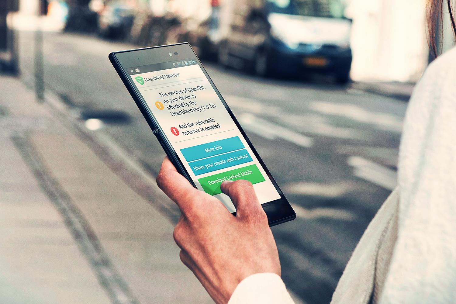
Thanks to technological advances made ​​in mobility , almost all phones and gadgets of today offer internet connectivity . With this in mind , more and more users access to websites and blogs via their mobile phones , creating a need among webmasters and authors of blogs and adapt their content to this new group of users and visitors .

What are the differences between a traditional website and a website optimized for mobile ?

Depending on how the common site is developed , it can come to function satisfactorily in a fit coming from mobile or tablets , but the most common is that it does not, making it difficult and even impossible , shipping done via mobile.

Websites optimized for mobile phones are developed taking into account some specific factors such as :

Resolution optimized for phones and tablets screen.
Do not use incompatible technologies such as flash, which does not play on devices like the Ipad or Iphone.
Usability and simplified navigation .
Correct layout of the elements and site columns , and concern for the load time .
Suitability for specific operating systems and browsers such as Android , iOS , Safari , etc. .

As the process of developing mobile sites work?

The mobile version of the site is basically a simplified version of the traditional website . We must understand what is most important to the company and shape the navigation so that the client does not have difficulties in meeting their goals . For all intents and purposes , is a new version of the site , maintaining common elements such as layout , content, images , etc. .

Mobile market

The mobile market is exploding around the world , and of course in some countries are slower than others over the mobile technology is growing in all sectors indistrial . Learn why and how to seize opportunities .

In Brazil for example has already surpassed more mobile than people for some time . Also in 2010 , hit the milestone of 200 million lines . Since then , the volume of lines keeps growing to the point that we already have the ninth digit in SP cell numbers in July 2012 .

Despite all this , I believe 2014 will be a special year for the mobile market . A lot is happening now in this area . And the potential is enormous .

So do not delay, request a quote on Amriss and conquer new markets .


Friday 28 March 2014

Responsive design helps in SEO (Google)


The responsive layout works differently . It works on the same domain , the same elements in HTML and uses CSS to present the content differently depending on the resolution of the user. That is, you have only one site , which adapts to the user's in many devices.


Responsive website uses a single HTML and through CSS3 Media queries and other techniques and treatment of resizing images , can maintain the essential integrity of the site , working with just a stylesheet and even then preparing your site for different resolutions .


Responsive Design and SEO according to Google
Not me who is saying, is a 2012 text published in Official Google Webmaster blog Official Google Webmaster Central Blog: Recommendations for building smartphone-optimized ...  . Responsive design is the " recommended configuration " the search site . There are some whys for this fact :


- With a single domain , it becomes easier for Google's crawlers to deal with your site .

- Without a specific site for mobile , Google does not need to use specific crawlers to your website .

- The only site allows its users to share your links more easily , increasing the number of backlinks and consequently its PageRank .

Thus , thinking about the SEO of your site , always opt for responsive design . It's a real tip from a reliable source and that you should take into account.

If you do not know how to take advantage of responsiveness in your business, Amriss http://www.amriss.com/  offers the creation of responsive sites for a great price . Still let's talk more about it , so until next time!


Friday 21 March 2014

Amriss Blog Tips

Today all developers care about viewing their sites on mobile devices.

For those who often already uses some platform or Framework that provides a responsive structure to the site and just need to make some adjustments. I'll leave here some tips on how to create a responsive image .


* To change directly in css :

. responsive {
max-width : 500px ;
width: 100 % ;
height: auto; }

. responsive img {
 max-width : 500px ; / * Maximum width of image * /
width: 100 % ;
max -height: 300px ; / * Maximum height of image * /
min-height : auto; / * Minimum height by default " auto" * / }


In html , images must be inserted in the div "responsive " as shown below :

<div class="responsive">
        <img src="img-responsiva.jpg" alt="img-responsiva" />
 < / div >


* To change directly in the html tag <img> :

<img src="imagemresponsiva.jpg" style="max-width: 500px; width: 100%; auto; height: " alt="img-responsiva" />

In the tag " max-width " , you change the default width of the image .